Add a Title

Project Outcome
The refreshed brand system brings coherence, flexibility, and energy to Illustrative Mathematics' growing suite of offerings. By evolving the logo, clarifying the brand architecture, and designing a scalable identity system, we helped IM better connect with its audiences and support its mission of empowering teachers and igniting joyful math learning for all.


To support IM’s product ecosystem, we established a clear brand architecture and visual hierarchy for sub-brands. We crafted identities for key program areas like Curriculum, Assessments, and Professional Learning, each with distinct but connected visual treatments. Color-coded anchors, typography rules, and lock-up models provided enough distinction without creating fragmentation. The system was documented in a comprehensive brand guide for long-term use.
Making Math Click: Designing a Visual System for Engagement
lllustrative Mathematics, a nonprofit math curriculum provider, had grown rapidly, adding product lines and reaching diverse classroom audiences, yet its brand and visual language lagged behind. They needed a refreshed identity system that could unify all sub-brands, support varied user experiences (teachers, students, coaches), and reflect a more engaging, intuitive approach to math learning. The mission was to design an identity framework that balances clarity, joy, and educational rigor.
Deliverables
Identity Design
Visual System Design
Brand Guidelines


We refined IM’s existing logo to enhance its clarity and usability across digital and print environments. Subtle adjustments modernized the mark while retaining its core recognizability. We clarified typography and spacing for improved legibility and created logo variants to adapt to different brand needs. This gave the brand a stronger foundation without losing its established equity.
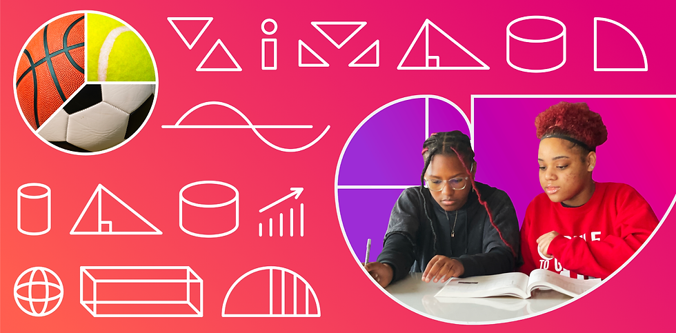
We created a cohesive visual language rooted in geometry, learning pathways, and bold simplicity. A flexible grid system, extended color palette, and illustration motifs helped express the brand’s personality across touchpoints. Every element, from slide templates to iconography, was designed to ensure clarity for educators while feeling inviting for students. Accessibility and modularity were central to the system’s success.


Client
Illustrative Mathematics
Sector
Nonprofit & Education
Project Type
Design
Role
Design Director | Constructive
